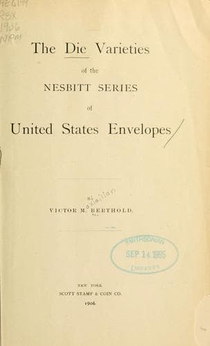
The Die Varieties of the Nesbitt Series of United States Envelopes — John Shaqi
The Die Varieties of the Nesbitt Series of United States EnvelopesBerthold, Victor Maximilian
History
The Die Varieties of the Nesbitt Series of United States Envelopes
Berthold, Victor Maximilian
Postage stamps -- United States
These twenty die varieties are grouped into two classes by the use of a
unit distance measurement of 14 and 12 mm. respectively.
Class I.
[Illustration]
A line 14mm. long will extend from the point where the upper left curve
meets the inner white frame-line to the end of the final "E" of
"THREE".
[Illustration]
Group A:--A line 12mm. long, starting from the junction of
the upper left curve and the inner, white, frame-line will
extend to the end of the horizontal stroke of the first "E"
of "THREE". (Var. 11 to 18.)
Group B:--A line 12mm. long, starting from the junction of
the upper left curve and the inner, white, frame-line will
extend to a point just beyond the end of the horizontal
stroke of the first "E" of "THREE". (Var. 19 to 27.)
Class II.
[Illustration]
A line 14mm. long, starting from the junction of the upper left curve
and the inner, white, frame-line, will extend to a point just outside
of the final "E" of "THREE". (Var. 28 to 30.)
[Illustration]
Variety 11:--THE TOP STROKE OF "N," IF EXTENDED, WOULD
BISECT THE VERTICAL STROKE OF "T". "RE" very wide at top.
"T" and "E" about an equal distance from curves. Lower left
curve well rounded. "EN" near at top. "N" broad.
Variety 12:--THE SMALL HORIZONTAL LINE OF "N," IF EXTENDED,
WOULD CUT THE VERTICAL DOWNSTROKE OF "T." All the centre
crossbars of "Es" touch the horizontal upper stroke. "N" of
"CENTS" is narrow; is the lowest letter, and has a heavy
middle line. "T" and "E" are close to the curves, which are
short. "TS" close and on level.
There are often two dots in the central oval, one near the
throat and the other opposite the third loop above "C".
Compare variety 11 for "NT," also variety 21.
Variety 13:--A FLAW IN THE DESIGN, caused by the addition of
a short line immediately above the right lower curve and at
the beginning of the first loop. "TH" wide. "RE" wide at
top. "CE" near. The entire word "CENTS" is well in the
centre of the label. "S" above level of "T". Note the wide
distance of "C" from the lower left corner.
[Illustration]
Variety 14:--THIS DIE SHOWS THE WIDEST SPACING OF "THREE".
Lower left curve is deep; slants back and is far from "C".
Lower right curve near "S". "T" and "E" about equally far
from curves. Upper right curve much flattened. Note "T"
short and top of "C" considerably below inner oval line.
Note also that centre of first loop below upper right curve
is unfinished. "TH" wide at base; "CE" near: "EN" wide. "N"
_tall and narrow_.
Public-domain text, read in full here on John Shaqi.
Reviews
Reviews
No reviews yet
Be the first to share your thoughts on this work.
Join the Discussion
Join the discussion
Sign in to leave a comment or review.
Sign InorCreate an account