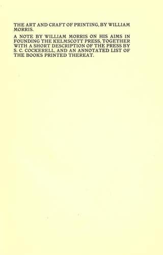
Hammersmith (London, England) -- Imprints; Kelmscott Press; Printing -- Great Britain -- History
Printing, in the only sense with which we are at present concerned,
differs from most if not from all the arts and crafts represented in the
exhibition in being comparatively modern. For although the Chinese took
impressions from wood blocks engraved in relief for centuries before the
wood-cutters of the Netherlands, by a similar process, produced the
block books, which were the immediate predecessors of the true printed
book, the invention of movable metal letters in the middle of the
fifteenth century may justly be considered as the invention of the art
of printing. And it is worth mention in passing that, as an example of
fine typography, the earliest book printed with movable types, the
Gutenberg, or "forty-two line Bible" of about 1455, has never been
surpassed.
Printing, then, for our purpose, may be considered as the art of making
books by means of movable types. Now, as all books not primarily
intended as picture-books consist principally of types composed to form
letterpress, it is of the first importance that the letter used should
be fine in form; especially as no more time is occupied, or cost
incurred, in casting, setting, or printing beautiful letters than in the
same operations with ugly ones. And it was a matter of course that in
the Middle Ages, when the craftsmen took care that beautiful form should
always be a part of their productions whatever they were, the forms of
printed letters should be beautiful, and that their arrangement on the
page should be reasonable and a help to the shapeliness of the letters
themselves. The Middle Ages brought caligraphy to perfection, and it was
natural therefore that the forms of printed letters should follow more
or less closely those of the written character, and they followed them
very closely. The first books were printed in black letter, i. e., the
letter which was a Gothic development of the ancient Roman character,
and which developed more completely and satisfactorily on the side of
the "lower-case" than the capital letters; the "lower-case" being in
fact invented in the early Middle Ages. The earliest book printed with
movable type, the aforesaid Gutenberg Bible, is printed in letters
which are an exact imitation of the more formal ecclesiastical writing
which obtained at that time; this has since been called "missal type,"
and was in fact the kind of letter used in the many splendid missals,
psalters, etc., produced by printing in the fifteenth century. But the
first Bible actually dated (which also was printed at Mainz by Peter
Schoeffer in the year 1462) imitates a much freer hand, simpler,
rounder, and less spiky, and therefore far pleasanter and easier to
read. On the whole the type of this book may be considered the
ne-plus-ultra of Gothic type, especially as regards the lower-case
letters; and type very similar was used during the next fifteen or
twenty years not only by Schoeffer, but by printers in Strasburg,
Basle, Paris, Lubeck, and other cities.
Public-domain text, read in full here on John Shaqi.
Reviews
Reviews
No reviews yet
Be the first to share your thoughts on this work.
Join the Discussion
Join the discussion
Sign in to leave a comment or review.
Sign InorCreate an account