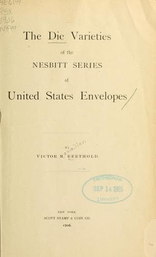
The Die Varieties of the Nesbitt Series of United States EnvelopesBerthold, Victor Maximilian
History
The Die Varieties of the Nesbitt Series of United States Envelopes
Berthold, Victor Maximilian
Postage stamps -- United States
CLASS II.
[Illustration]
Variety 9:--Circular "C." Smallest lettering in Die B, "U"
near circle. "U" small, short and near "3." "TE" almost
joined at top. "DS" close. "STATES" spaced closely, and
final "S" far from "3." "T" of "THREE" slender and far from
"3." "HR" wide. "EC" near. "C" of "CENTS" small, almost
circular, and its end-curves close together. "S" far from
"3." There is often a white dot over the centre of "R" of
"THREE."
Variety 10:--"U" nearly touches circle. Medium large
lettering. "U" very close to "3;" it is long and wide open.
"NT" widely spaced. "DS" wide at top. "T" of "THREE" far
from "3." "RE" widely spaced. "EC" near. "C" of "CENTS"
round with a wide space between the end-curves. Wide space
between "C" and "E." "S" far from "3." "ENTS" appear smaller
than the other letters.
[Illustration]
Variety 11:--"EC" very wide; "U" rather small. Large
lettering. "U" narrow and far from "3." "D" of "UNITED"
large and rounded, and "ED" close. "DS" close. Note in
"STATES" wide space between "T" and "E." "ES" close at base.
"S" far from "3." "T" of "THREE" near "3." "HRE" well
spaced. "C" of "CENTS" round; top curve, short. "S" near
"3."
Variety 12:--"U" far from circle. Large, round "C" close to
"E." Large lettering. Second bar of "U" thinner than first.
"UNIT" closely spaced; "ED" wide at top. "DS" near. "ST" of
"STATES" close. The entire word "STATES" is very closely
spaced. "S" far from "3." "T" of "THREE" near "3." Note that
"RE" are close at top. "EE" close. "N" is unusually broad.
"TS" almost touch. "S" far from "3."
[Illustration]
Variety 13:--There is generally a dot under right circle.
Large lettering. "U" near "3" "UNITED" closely spaced. "DS"
near. "STATES" is also closely spaced. "S" near "3." "T" of
"THREE" short and near "3," and "TH" wide at base. "REE"
well spaced. "EC" near. "C" of "CENTS" elongated, tipped to
the left, and its end curves wide apart. "CE" well spaced,
but "ENTS" close. "S" near "3." There is frequently a dot
after "S" of "CENTS." Found on white and buff.
CLASS III.
[Illustration]
Variety 14:--"U" very far from circle. Small letters. "U" of
"UNITED" small and contracted. "UNITED" is closely spaced,
but "ED" is wide at top. "DS" near. Excepting "ST" the rest
of "STATES" is also closely spaced. "S" near "3." "T" of
"THREE" close to "3." "TH" near. "HREE" well spaced. "C" of
"CENTS" is small and its curves short. "S" far from "3."
CLASS IV.
[Illustration]
Public-domain text, read in full here on John Shaqi.
Reviews
Reviews
No reviews yet
Be the first to share your thoughts on this work.
Join the Discussion
Join the discussion
Sign in to leave a comment or review.
Sign InorCreate an account