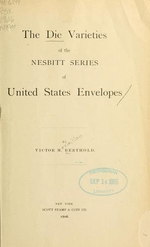
The Die Varieties of the Nesbitt Series of United States Envelopes — John Shaqi
The Die Varieties of the Nesbitt Series of United States EnvelopesBerthold, Victor Maximilian
History
The Die Varieties of the Nesbitt Series of United States Envelopes
Berthold, Victor Maximilian
Postage stamps -- United States
Variety 2:--Open, short "U." Large, wide open "C." Small
lettering. Wide, open "U," and far from "3." "NITE" widely
spaced. "TAT" well spaced at top. "S" near "3." "T" of
"THREE" near "3." "EC" wide. "C" of "CENTS" is tall, well
rounded, and its ends are far apart. "S" of "CENTS" far from
"3." Found on white and buff paper, quite rare.
CLASS III.
Variety 3:--Smallest letters; "S" of "CENTS" not so near as
in Var. 4. "U" very small, contracted at top, and far from
"3." "UNITE" evenly spaced; "ED" wide at top and "D" in an
almost vertical position. "DS" wide. "TA" of "STATES" wide
at top. "T" of "THREE" near "3." "EC" wide. "C" small and
wide open. "C" far from "E." "TS" close at top. Common on
both papers.
[Illustration]
Variety 4:--Similar to variety 3. "S" of "STATES" nearer
circle. The lettering of this variety is like that of
Variety 3, but "U" of "UNITED" is nearer "3" and "S" of
"CENTS" close to "3." Note also that the top stroke of the
"T" of "THREE" is shorter on the left than on the right.
Found only on buff, but quite common.
CLASS IV.
Variety 5:--"U" very near circle. Rather small letters.
Space between bars of "U" narrow. "NI" wide at top. "DS"
near. Final "S" of "STATES" near "3." "T" of "THREE" very
far from "3." "C" small, open and end poorly rounded. "EC"
wide. "S" of "CENTS" far from "3." Perhaps the rarest of all
the varieties.
Variety 6:--"C" large, well formed, and far from "E."
Similar to Variety 5. "U" further from "3," more open, and
larger than in Variety 5. "C" well rounded and large. "S" of
"STATES" large.
[Illustration]
Variety 7:--Elongated "C" with dot in centre. Large
lettering. "U" nearly horizontal and near "3." This variety
has several characteristic features. 1st:--"TS" of "CENTS"
is very widely spaced at base; 2nd:--"C" of "CENTS" is tall,
straight and oval shaped. 3rd:--The left cross stroke of "T"
of "THREE" is very short, and the letter is out of
proportion to those of the rest of the inscription. "EE" of
"THREE" widely spaced. "D" is large and slants decidedly to
the left. "DS" close. Final "S" of "STATES" near "3." "EC"
wide. "S" of "CENTS" far from "3."
DIE B.
Excepting perhaps numbers 9 and 14, the lettering of the varieties of
this class is generally large.
CLASS I.
[Illustration]
Variety 8:--Widest space between "S" of "CENTS" and circle.
"U" narrow and tall, and in a nearly horizontal position;
first bar much thicker than the second. "D" of "UNITED" well
rounded at top. "DS" near. "S" in vertical position. Wide
distance at base of letters "TE" of "STATES." "ES" close,
and "S" near "3." "T" of "THREE" has a long crossbar and is
far from "3." "HR" widely spaced, but "R" and "E," as well
as "T" and "S" almost touch at top. "EC" near. "C" of
"CENTS" is large, oval and open.
Public-domain text, read in full here on John Shaqi.
Reviews
Reviews
No reviews yet
Be the first to share your thoughts on this work.
Join the Discussion
Join the discussion
Sign in to leave a comment or review.
Sign InorCreate an account